Origin Investments
Origin Investments
Portfolio Builder
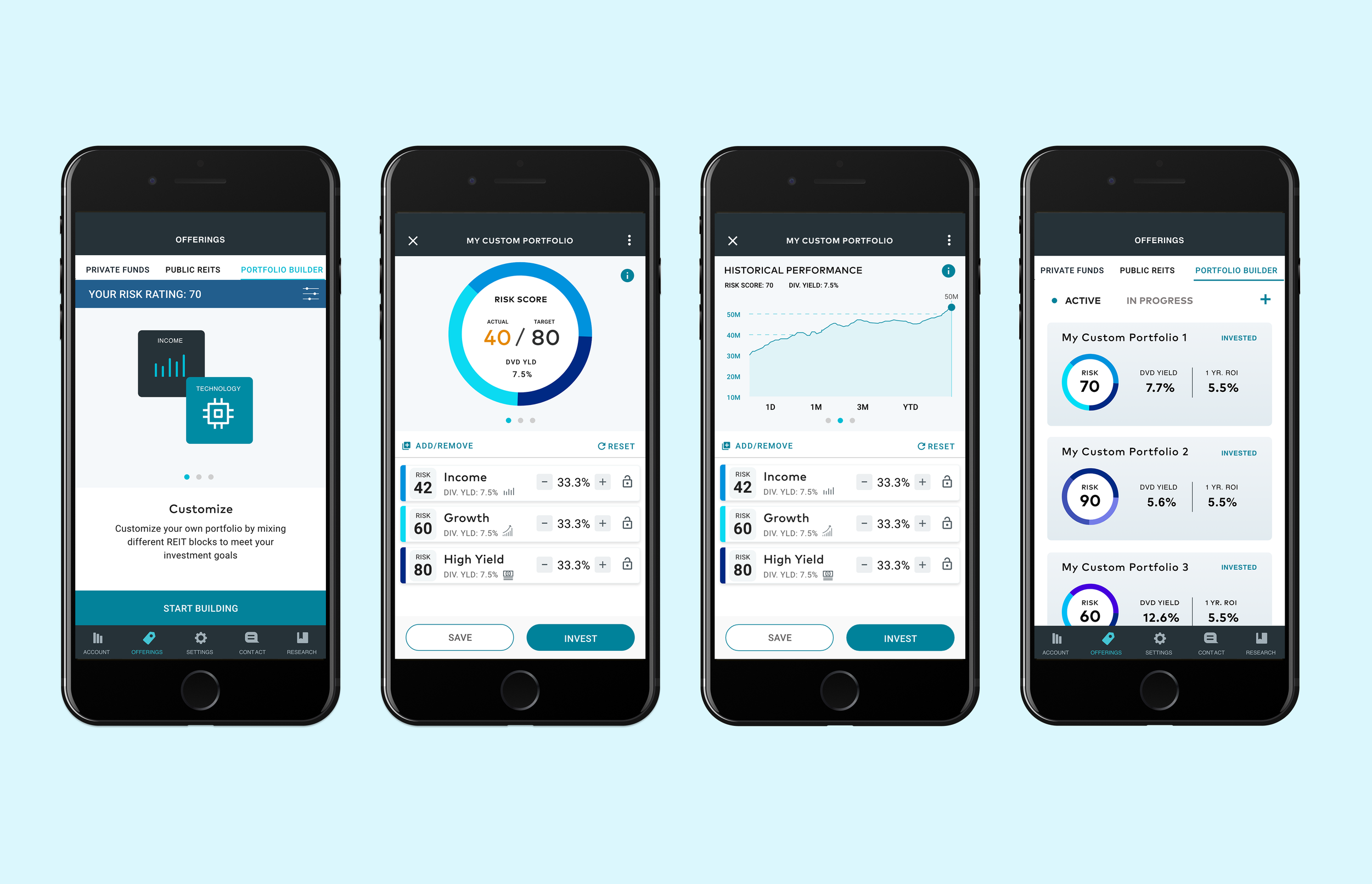
Origin Investments is a real estate brokerage firm, specializing in their offerings of Real Estate Investment Trusts(REITs). They currently have an application to help investors curate a portfolio by investing in different REITs. I was tasked to design a portfolio builder feature, which allowed investors to create a custom portfolio by allocating different REITs that suited their investment goals which was based on a Risk Number.
Role Team
UX/UI Designer Project Manager
Brand Designer
Duration Platform
3 Months React Native
The Problem
The main objectives for the portfolio builder were to offer a greater deal of personalization and customizability to the end user, while assisting and guiding them to reach their portfolio goal which they set for themselves. With this objective in mind, it was important to provide a good amount of information and feedback to let the user know if the portfolio they were building met their target risk score.
The Solution
I designed the portfolio builder with visualization graphics to provide constant feedback to the user whenever they made an adjustment to their portfolio. This involved creating a design system on how each of the REIT blocks could be identified based on their category, icon, and Risk Score. I also designed a doughnut allocation visualization to give users an indication of each of their REIT allocations as well as how close they were to their overall target risk score.
Focus group findings
Before we started the design process, we wanted to gather more information and detail on the target users’ main experience with the application. The target user for the portfolio builder feature were expert investors who wanted more freedom and customizability with their investment selections. We conducted a focus group interview to get detailed accounts on the main aspirations and objectives that these users had. I created a list of questions in order to foster and facilitate a dialogue among the participants in the focus group sessions. I asked questions relating to what aspects they valued most when reviewing and investing in different REIT blocks. I used this information as a basis on how to organize the visual hierarchy for each REIT block.
Information architecture
I reviewed the existing app architecture to assess the most appropriate place to house the portfolio builder feature.
End to end Interaction flow
I outlined an interaction flow that demonstrated the end-to-end experience of a user engaging with the portfolio builder tool with the goal of creating a portfolio that met their investment goal. I made sure to account for all the possible edge cases a user may encounter as they are interacting with this feature.
Designing builder dashboard experience
Now that the information architecture for the portfolio builder was prepared, I started creating wireframes to outline the overall structure and layout for the application designs.
I started with a rough outline of how the main information would be structured. I based the elements on how the user would interact with the information. The information can be defined as followed
The Goal
The main guide and driving influence for the users interactions. The user would make adjustments to their portfolio in order to reach their goal.
The Action
What the user would be doing in order to reach their goal, in this case picking and adjusting REIT block allocations.
The Outcome
The result of the user’s actions. The overall feedback the user would receive after making an adjustment to their REIT block allocations.
I organized this content into two categories, primary information and interactive information.
Portfolio visualization
I mocked up different ideas on how the information could be presented to the users, particulary the REIT block allocations and the Target Risk Score.
The challenge involved incorporating all the necessary information to give proper feedback to the user without overwhelming them with a lot of information. Since there was only so much space to work with, I had to prioritize the information based on what was most valuable in the portfolio-building experience.
The concept I played around with was having the risk score and target risk score within a pie allocation doughnut, to make the most out of space. Some of the earlier versions of the designs ended up feeling cramped with the amount of information presented. In the end I decided to go with the design that had the least amount of elements so users could quickly focus on the relevant information without being distracted.
REIT block visualization
Based on the information ranking in the focus group session, I created the main design and layout of the REIT block focused on what the target demographic valued the most when making an investment decision. Below are different iterations of the REIT block design.
Final design for production
I utilized the new updated brand guidelines provided by the lead designer of Origin Investments, for the visual designs of the application and applying to all the screens that contained the portfolio builder flow.
Sticking with the brand guidelines I created a library in Adobe XD for components that were used throughout the application to make the design file more organized.
After the designs were complete I exported the screens and design assets for development using Zeplin.


