
ServiceTitan
Inventory by ServiceTitan
ServiceTitan is a SaaS B2B company for the trades. Providing software solutions for trade businesses to manage various facets of their operation from dispatching field workers to creating estimates. One key part of many trade businesses is to manage and supervise the inventory of their warehouses. ServiceTitan created an inventory management web interface as a software solution. A mobile application was in development and I was tasked with updating the application with new features and getting it ready for launch.
Role Team
Sr. Product Designer Mobile Design
Engineering
Systems Designer
Duration Platform
1 Year iOS & Android
The Problem
The primary users for the Inventory management application are warehouse workers who are tasked with receiving and tracking all items and packages that are transported to the warehouse, as well as monitoring and keeping track of the inventory that is stored. Since there are many items for a user to track at any given time, the overall process and time spent completing tasks revealed to be inefficient.
The Solution
I designed a barcode scanning feature that helped streamline workflows between the primary users’ day to day tasks and the inventory management application. I also redesigned the visual design of the application to integrate with a new design system that was to be introduced with the launch of the mobile application as part of a rebranding initiative.
Discovering the problem
The first step in my design process was conducting user interviews with warehouse managers to understand their workflows and how they interacted with both the desktop system and existing tools. I also surveyed managers across multiple locations to gather broader insights. By mapping the user journey, my goal was to evaluate the overall work process and identify points of friction. A key inefficiency emerged during the receiving phase: workers frequently relied on barcode scanners to identify items, but these tools were not part of the ServiceTitan ecosystem. Instead, they tracked items manually and later re-entered the information into the desktop application, creating unnecessary duplication. This disconnect revealed the opportunity. The most effective way to streamline the process was to integrate barcode scanning directly into the mobile experience.

User journey of warehouse worker’s daily work flow
Updating the sitemap
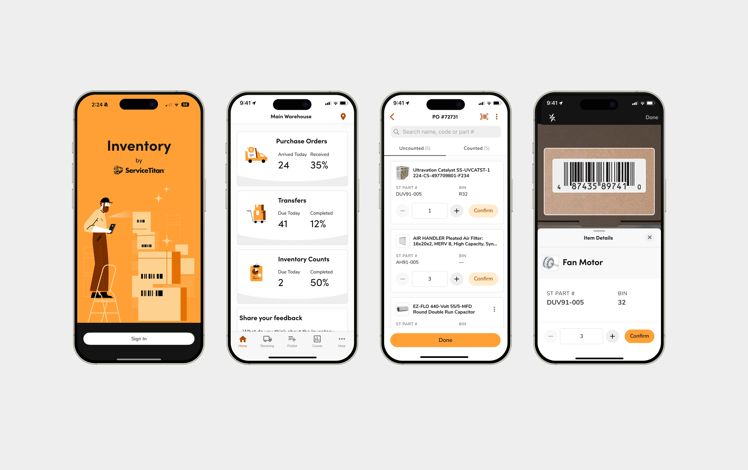
After gathering insights from surveying and interviewing warehouse managers, I reviewed the existing application to assess how the new functionality could streamline their process. This evaluation helped me determine whether any structural adjustments were necessary to support the feature while ensuring it fit seamlessly with user workflows and system requirements. I decided to include the barcode scanner along with the global features on the Item List page, since this is the section where users search for and identify items to count as per order. Alongside the search bar, a barcode scanner would be handy.

Deciding on the best barcode
scanning experience
When it came to the actual experience of using the barcode scanner, my initial approach was to model the existing design pattern already in the app. On the Item List page, users could see or search for items and relied on a quantity tapper to adjust the item amount. The barcode scanner utilized this framework but made the process more seamless by allowing the user to scan the item instead of scrolling through a list or typing in the item’s name (especially since some items had long names and different versions). However, after iterating on this flow, I realized that it did not take full advantage of the barcode scanner feature. Instead of treating the scanner as just a quicker way to surface the item, what if the scanner counted the items as well? Below are the two versions of the barcode scanning experience. I decided to test both versions in A/B Testing to see which approach was more effective.

Version A: User has to manually enter quantity

Version B: User automatically counts items with each scan and the user has the option to enter the quantity of items
Prototype testing
I developed low- to medium-fidelity prototypes for each version of the user flow to determine the most optimal and intuitive interaction. I conducted A/B testing with both prototypes, analyzing which version allowed users to complete the task in fewer steps while evaluating overall ease of use and task success rates. Based on the feedback, users liked the flexibility of the second version of the barcode scanner. However, they all mentioned that with their current workflow, when they scan an item, they scan the package of the item and count the quantity manually instead of using a barcode scanner for each piece. As a result, we decided to go with version A with the MVP and decided to explore the use case for version B for future releases.

Version A: User has to manually enter quantity (original)

Version B: User automatically counts items with each scan and the user has the option to enter the quantity of items (proposed)
Accounting for all screen states
Once the core barcode scanner flow was validated, I focused on designing additional screen states to handle edge cases and errors. A critical scenario was when a scanned barcode was not part of the vendor’s pricebook, which would otherwise leave users at a dead end. To address this, I designed screen states for the flow where scanning an unregistered item redirected users to the pricebook. From there, they could search and select the item to link the barcode, then return seamlessly to their scanning task without breaking their workflow.

Example of screen states for adding barcode to pricebook
Implementing a new design system
While I was designing new features such as the barcode scanner, a rebranding initiative was underway. The goal was to position ServiceTitan as a suite of applications, allowing users to quickly identify and differentiate between products. Each app would adopt a unique color palette while maintaining consistent branding across the suite. At the same time, a new mobile design system was also being developed. I collaborated closely with the mobile design and design systems teams to develop a new design system for the IMA app, the first in a series of mobile applications to be released on the App Store and Google Play Store. This process led to the creation of a design theme for the application called Anvil: Ember. We utilized a token system for the style guide to make the designs adaptable for both light and dark modes for both operating systems. The design system was built for native applications, which was informed by the Human Interface Guidelines and Material Design Guidelines respectively to each operating system. As part of the rebranding initiative, we made sure that all design elements and library components adhered to WCAG 2.1 guidelines for accessibility.

Light Mode version of high fidelity designs

Dark Mode version of high fidelity designs
Developer handoff
When preparing the designs for developer handoff, I implemented a file organization system in Figma that separated features for both iOS and Android. Previously, all features were housed in a single file, which was overwhelming for some developers to navigate. To improve navigation, I organized the files by feature using the naming convention: Application: Operating System: Feature. Each file was further divided into pages, with screens grouped by different flows for easier access and clarity. I created a group specific to the product and included secondary and tertiary files. Such as a file for components and an icon library, so that developers could have easy access to those specifics as well.
Metrics & outcomes
The Inventory Mobile Application successfully launched its first iteration to the App Store and Google Play store. It was the first native mobile application launched by the company.
Prior to the barcode scanning feature, manual entries took an average of 13 seconds for the user to find and start counting an item. With the barcode scanning feature, this time was reduced to an average of 6 seconds, marking a 53.8% in reduced time spent.
When asking users how likely they were to use the ServiceTitan application for all their work objectives now that it had the barcode scanning feature, all of them mentioned that they would primarily use the application for their inventory management needs, providing an average CSAT score of 85%.
