EczemaWise
EczemaWise by National Eczema Association
EczemaWise is a digital tool created for people living with eczema. It originally existed as a website, but the National Eczema Association needed a mobile application to make it more accessible. As the lead UX/UI designer, I was responsible for adapting all features into a seamless mobile experience. Creating both the information architecture as well as the final visual designs for the interface. This is a case study on the Learn feature where patients can view and understand trends in their tracker data.
Role Team
Lead UX/UI Designer Product Manager
Engineering
NEA Board
Duration Platform
1 Year React Native
The Problem
The app’s key value was that it allowed users to track multiple symptoms and lifestyle factors simultaneously. While powerful, this presented a design challenge:
The tracked data needed to be actionable, not overwhelming.
The new “Learn” section was meant to provide insights and patterns, not duplicate Track.
If Learn simply replicated all details, users would face redundancy, confusion, and information overload.
The Solution
I designed a data visualization interface that gave users a clearer, more structured experience:
Users could see data across multiple trackers at a glance, understanding patterns and trends without feeling overwhelmed.
The information architecture for the mobile experience simplified the experience and reduced information overlap between the Track feature. While allowing the flexibility for the users to view more detailed information.
This ensured the experience was both comprehensive and focused.
Adapting for mobile
On the web, EczemaWise displayed all tracked data points in one graph. Research identified five primary triggers—skin symptoms, pain, itch, stress, and sleep—as most important to users, while all other trackers were grouped as secondary information. Before I jumped into design, I studied the web interface, and interviewed the NEA advisory board that consisted of patients and experts to gain insight on how they utilized the information and data.
The challenge:
Primary triggers were emphasized, but secondary data lacked hierarchy and felt cluttered.
Users told us they mainly relied on the graph for primary trackers, though they appreciated having secondary information available such as what they may have eaten that day, to see if there are any links between the data. The learn feature had to tell them a story.
For mobile, I needed to:
Keep the primary five trackers central in the graph.
Ensure secondary data remained accessible without introducing cognitive overload.
This became a key driver of the design exploration.

Web interface for learn tab and trend data
Research
I explored related apps to see how they handled complex symptom tracking:
Bearable and Flaredown: Offered multi-symptom tracking but only displayed one metric per chart.
Track & Graph: Allowed multiple data sets in one view, but wasn’t designed for health tracking and lacked user-friendly visualization.
None directly addressed the problem of showing multiple line charts for different data points in the same graph. This confirmed that EczemaWise’s use case was unique: no existing solution showed multiple line charts for different data points within the same graph in a way that was both comprehensive and accessible on mobile.

CCA on Bearable, Flaredown, and Track & Graph.
Primary data
The first issue was how to present the five primary trackers (skin, itch, pain, stress, sleep) beneath the line graph. I iterated two versions. One that had the primary trackers stacked beneath the graph. The other had a horizontal display, where the data points sat next to each other. I adopted the horizontal row with filtering. It improved readability, freed space for the graph, and reinforced consistency across the app.

Wireframe iterations for graph data display.
Information architecture
The main design issue was around the information architecture. Should all the data sit in a single page, where users would scroll? Or should I comportmentalize the flow so users have the high level summary without being overwhelmed with secondary information?
Single Scroll (Web parity):
Pros: Mobile-native scrolling, fewer taps, all context in one place.
Cons: Information overload on small screens, redundant with Track, blurred the line between input vs. insight.
Protoype excerpt of single scroll
Two-Screen Flow (Proposed):
Pros: Lightweight summary first, clear IA distinction (Track = input, Learn = insight), reduced cognitive load.
Cons: One extra tap required to see more details, less continuous than a scroll.
Prototype excerpt of two-screen flow.
I used both versions in A/B testing to get feedback from users on how they responded to each layout.
Testing & insights
My objective with A/B testing was to see which version was most responsive to how users viewed and received information. I also wanted to see if they understood the dilineatation between track and Learn.
Through A/B testing, I discovered a clear trade-off:
Single scroll felt familiar but caused confusion. When giving user the task to update a tracker after they reviewed the learn page, users often tried to edit directly in Learn.
Two-screen matched expectations: “Track is where I put things in. Learn is where I see what it means.”
The lighter summary-first view was perceived as faster and less overwhelming. As one user put it, “The graph feels like a high level birds eye view to see data over time. If I notice a pattern, or was more curious about what happened that day, I would click to see the full detailed report”
Based on these findings, I decided to go with the two-screen approach.
High fidelity design
The final solution adopted a horizontal tracker layout paired with a two-screen Learn flow. This balanced clarity, flexibility, and role separation between Track and Learn.
I incorporated the National Eczema Association’s updated branding for the interface designs and created a component and design library with the appropriate assets that could be updated based on new brand guidelines. This ensured visual consistency with NEA’s broader ecosystem and reinforced the app’s credibility.

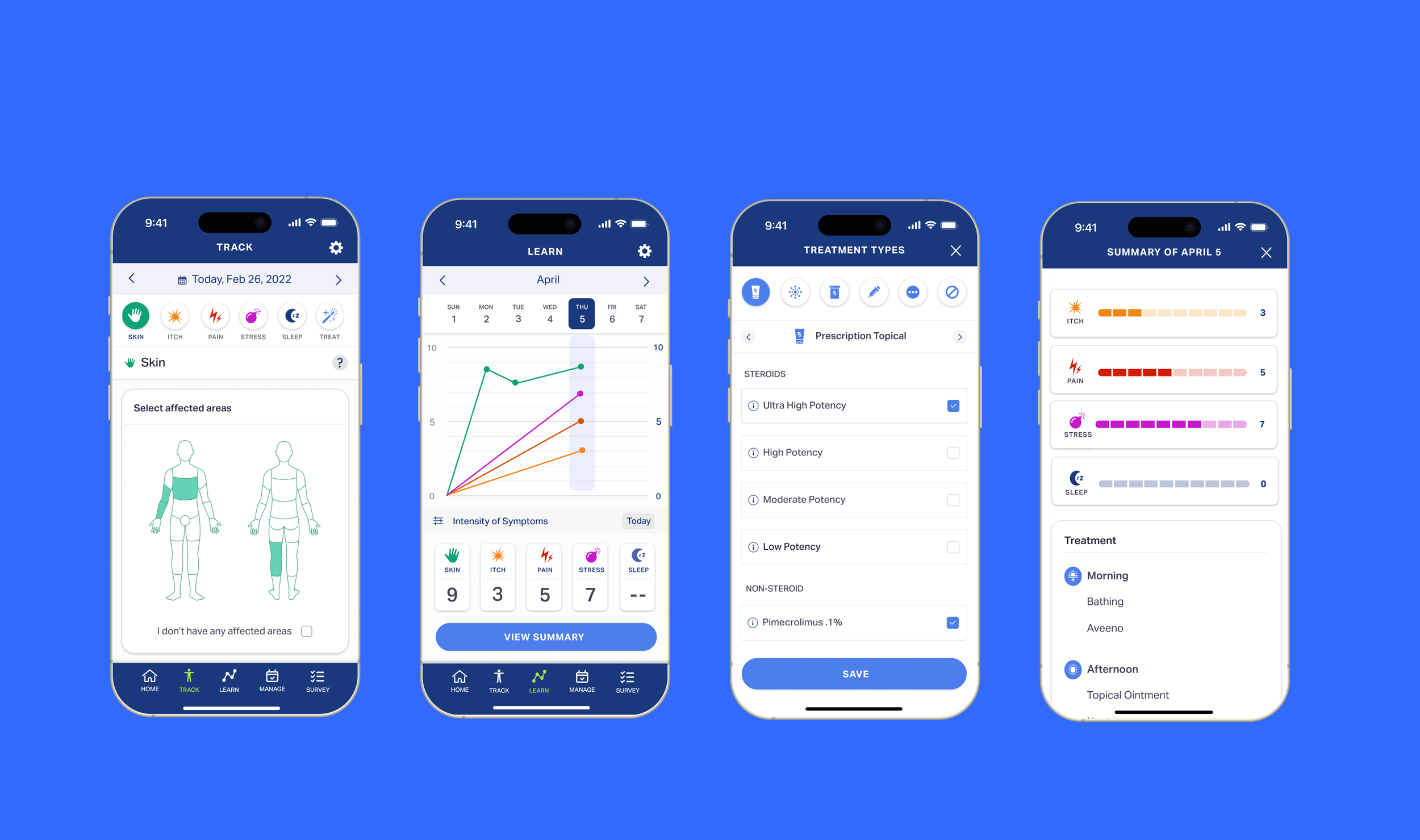
Example of high fidelity screens.
Product launch
EczemaWise successfully launched on both iOS and Android platforms. Since this was the first iteration of the application, I oversaw the launch from a design perspective, and worked closely with developers and stakeholders to address any issues. Since its release, it has earned significant recognition, including:
Two Platinum eHealthcare Leadership Awards for Best Care/Disease Management and Best Mobile App (2022)
Gold Digital Health Award (2024)
The app continues to be recognized for its impact in digital health, helping thousands of people with eczema manage their symptoms more effectively. It is currently the highest rated eczema tracker app with an average rating of 4.5 out of 273 reviews for both iOS and Android, making it the current leading eczema tracker application on the market. Learn more here.

